When the structure is fixed, the interface does the work
Redesigning the purchase steps of an online insurance quote journey, and bringing an in-house UI system to its first client project.
MotorEasy asked Netro42 to improve its online quote journeys, starting with GAP insurance. The six-step structure was fixed, and with no design files, the live site was our only source of truth. I owned the purchase half of the journey (Add-ons, Review & Finalise, Payment, and Confirmation) and the UI kit both designers used.
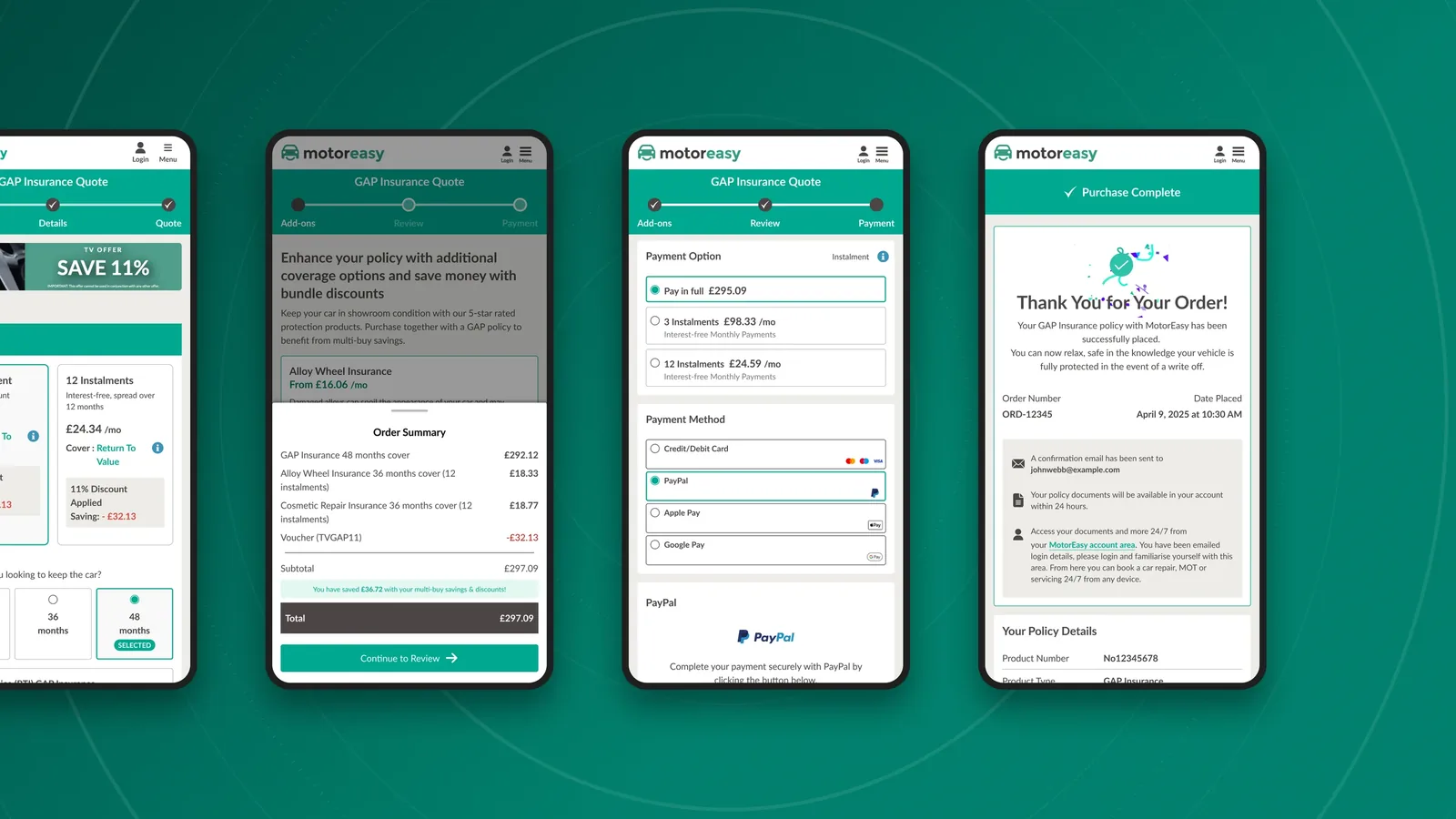
At a glance
The problem
A quote journey that felt long, with a structure we couldn't change
MotorEasy is a motorist platform offering cover, servicing and warranties in one account. Netro42 had been its technology partner for over twenty years, but only ever on development and security. In 2025, the client came to us for design. They wanted more customers to request quotes and buy online in a competitive market.
The first journey was GAP (Guaranteed Asset Protection): insurance that covers the difference between what a car is worth and what the driver paid or still owes if the car is written off or stolen.
Three constraints:
- The step count was fixed. Six steps, for technical and legacy reasons. The most obvious fix for a long journey was off the table.
- Light touch on visuals. The rollout was phased, so GAP couldn't look different from the journeys still running the old design.
- No design files existed. The live site was our only source of truth.
My role and the team
Two designers, one journey, split down the middle
My colleague and I worked from the same library from the first sprint, so the two halves stayed one journey.
How we worked together: We held weekly reviews with the client and marketing team, presenting each finding next to a proposed fix. Later, we collaborated with the developer, and our account handler managed scope, budget and the client relationship.
Steps 4-6 and the confirmation page, audit and UI kit.
Steps 1-3, audit, and the data-collection stretch.
Full implementation, and the token pipeline from Figma into the codebase.
What we knew
Building on MotorEasy's own insight
The scope was built on insights our client's own teams had already gathered, tried and tested, and we added our own evaluation to it: Working sessions with the marketing team, Hotjar heatmaps, Call-centre sales scripts, and a moderated walkthrough I did with a colleague who owns a car and holds an account.
We then audited the live journey for UI, UX, performance, responsiveness and accessibility, and grouped it into three themes: responsiveness and consistency, perception and communication, and UI and usability.
Two decisions inside a fixed structure
1. The stepper header: reduce the felt cost, not the step count
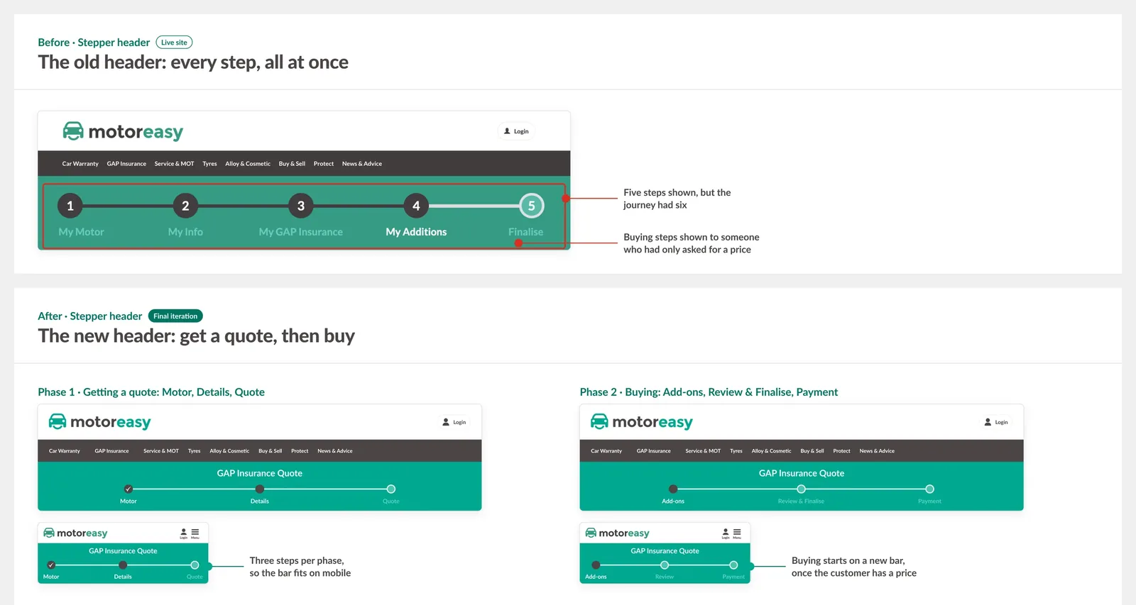
The quote journey felt long, and the header made it worse by showing all the steps at once. It also showed five steps when there were six, and it didn't work on mobile. We couldn't merge or remove steps, so we kept the structure and cut the effort inside each step. I redesigned the header around a two-phase model, getting a quote and then buying, so it shows three steps at a time.
Where we landed and whyThe options we weighed
Options: 1. Challenge the constraint and push to merge or remove steps. 2. Keep the structure and cut the effort inside each step. 3. Accept the length and spend the scope on visuals.
Where we landed, and why: We chose the second option. The first was outside our control and would have put the budget, timeline, and phased engagement at risk. The third would have left "this takes too long" unsolved, and that was the actual complaint.
Before, each step showed every field at once, and the fields didn't have enough contrast. In steps 1–3, the Head of Design used progressive disclosure, so customers saw only the fields relevant to their answers, built from the UI kit's form fields with accessible contrast. I redesigned the header around a two-phase model: getting a quote, then buying. The structure stayed the same, but the header now shows three steps at a time instead of every step at once.
What I'd revisit: I built the stepper mobile-first, and simplifying it cost the step numbers and the state colours. For accessibility and visibility, I gave those up too easily. The numbers help people track where they are, and colour alone is a weak way to show state. I'd keep both and simplify something else.
2. The Add-ons step, and the call I got wrong
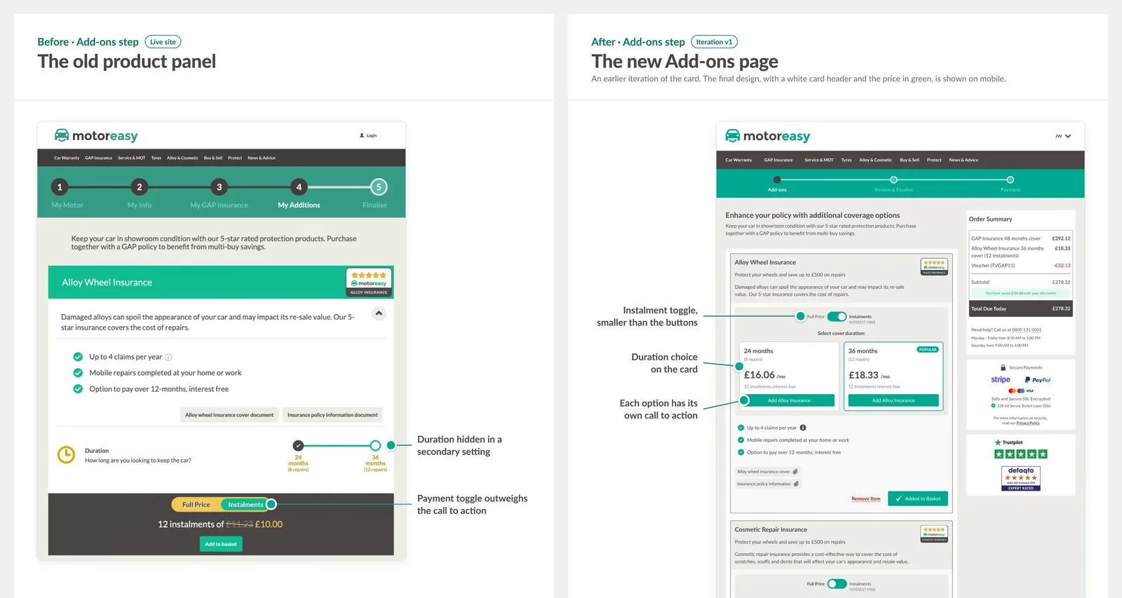
Step 4 is optional: customers add compatible products with multi-buy savings. It pulled them away from the main goal, so I recommended moving it after checkout. The client and team saw that as adding risk to the scope, so we kept the step and designed the page properly. The new product cards carry the duration choice, the instalment toggle and the multi-buy saving, and I redesigned the add-to-basket toast.
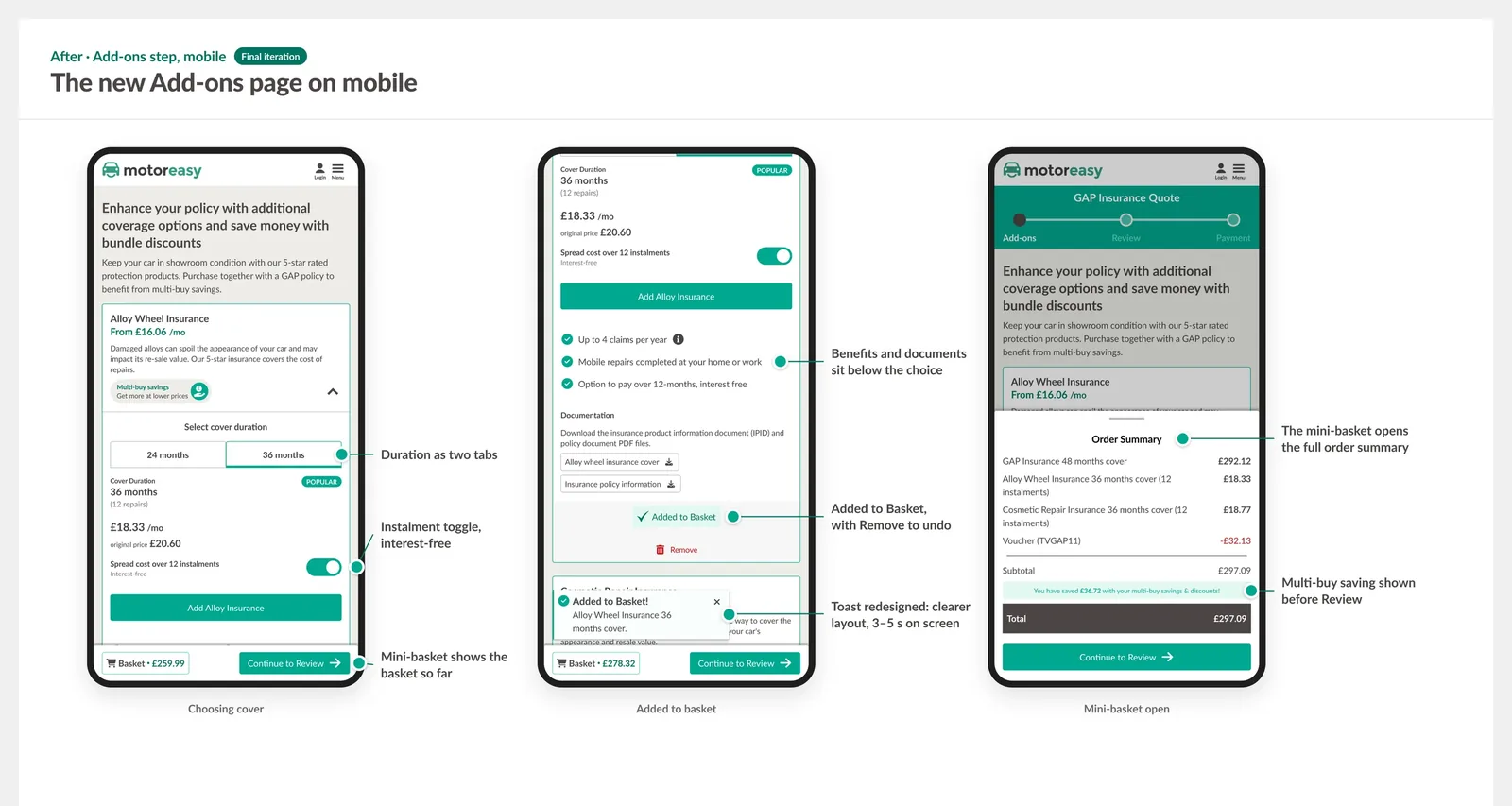
I also redesigned the add-to-basket toast. The old one's timing and design got in the way. Now, it sits where customers expect it (top right on desktop, bottom left on mobile), stays for 3–5 seconds, can be closed, and stacks when several products are added.
Where we landed and whyThe options we weighed
Options: 1. Move the step after checkout, the usual e-commerce pattern for secondary products. This needed technical work and a review by product marketing. 2. Keep the step where it was and make it as good as the constraints allowed, then watch how it performed after launch and iterate.
Where we landed, and why: In a weekly meeting, I recommended moving it. The client and team perceived it as adding risk to the scope and ramifications in other parts of the system, and we couldn't see its knock-on effects from inside a single quote journey. That was reasonable. So we kept the existing structure and designed the page properly anyway.
The new product cards carry the duration choice, the instalment toggle and the multi-buy saving, each with its own call to action. Supporting benefits and documents sit below, so they don't all compete at once. Working with our developer on the minimum configuration each product needed gave us a card pattern that could take new products as the range grew.
The call I got wrong: I made the argument once, verbally, and moved on. I didn't build an artefact or estimate the drop-off. After GAP went live, we saw drop-off at the add-ons step. I don't have figures for it, so it's an observation, not a measurement. On the next journey, Warranty, the client removed Add-ons from the quote.
From Review to Confirmation
Review & Finalise and Payment: an order summary that stays with you
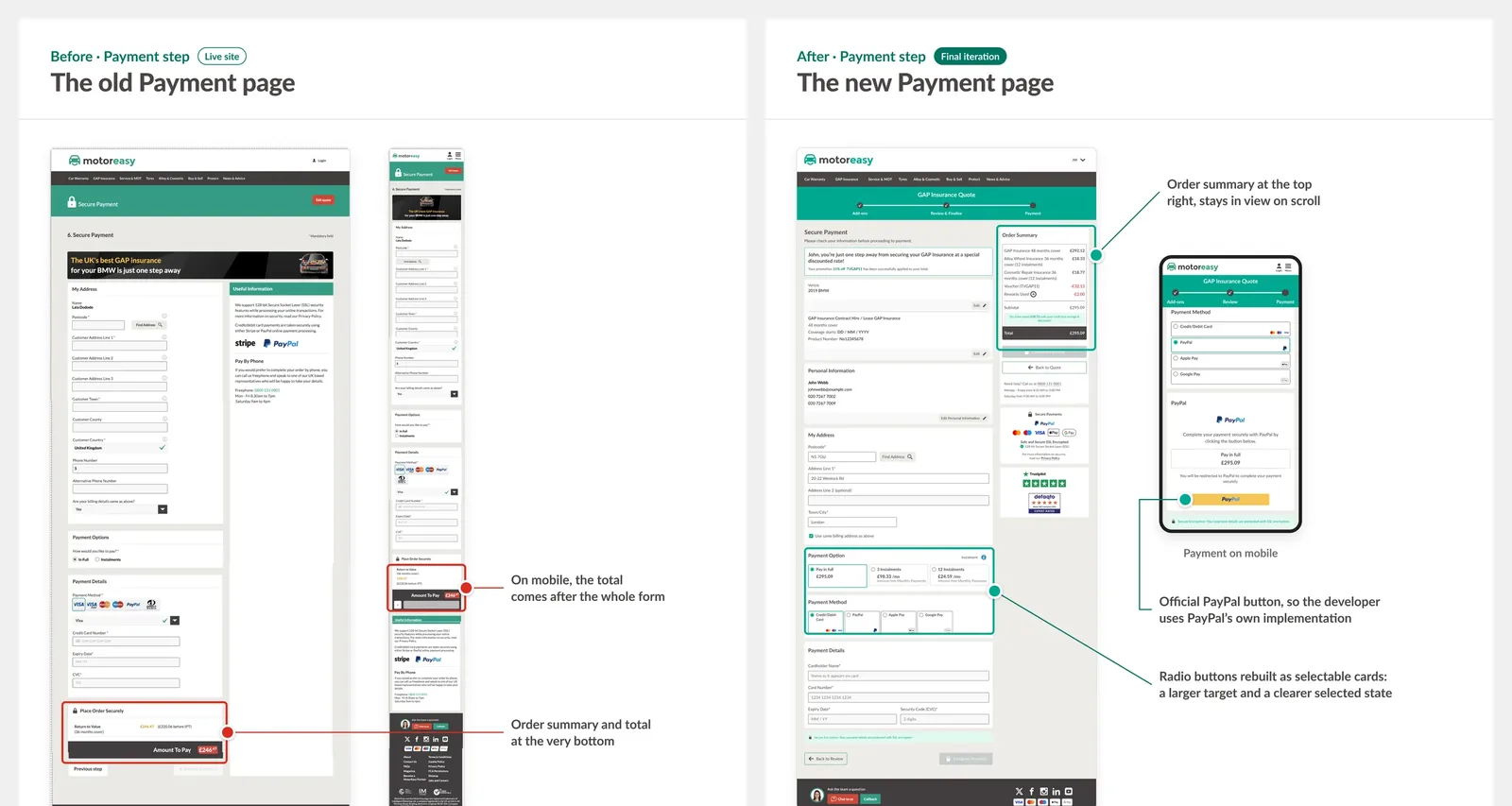
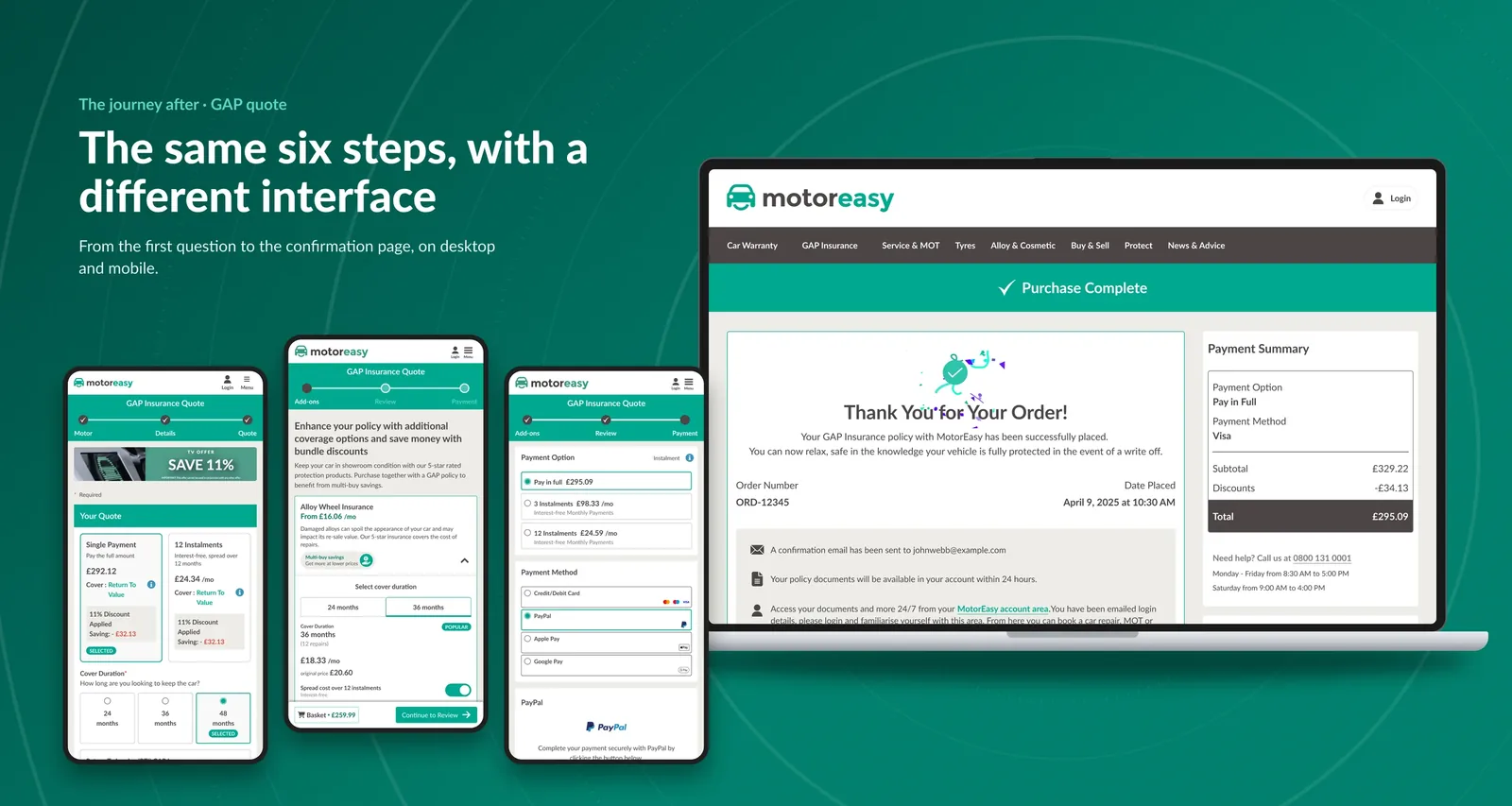
Neither page was mobile-friendly, and the order summary, the one thing customers check before they pay, sat at the bottom of the page. I designed both pages from scratch, mobile-first. On desktop, the order summary moved to the top right and stays in view as customers scroll. On mobile, it became a persistent mini-basket that customers can open at any time.
Where we landed and whyThe options we weighed
What I chose, and why: I designed both pages from scratch, mobile-first. On desktop, the order summary moved to the top right and stays in view as customers scroll, so the price and what's included are always visible. On mobile, it became a persistent mini-basket on Add-ons and Review, showing the basket total, which customers can open at any time. They were new components, and I walked our developer through the prototype and documented the flow before he built it. I simplified the content on each page to what's relevant at that moment.
Confirmation page: everything it needed was already in the email
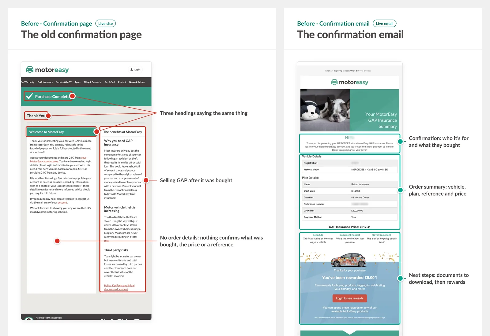
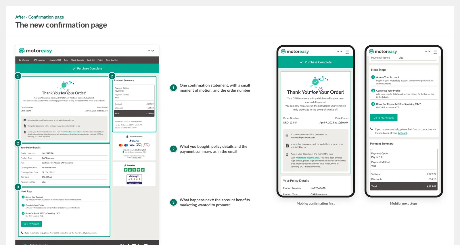
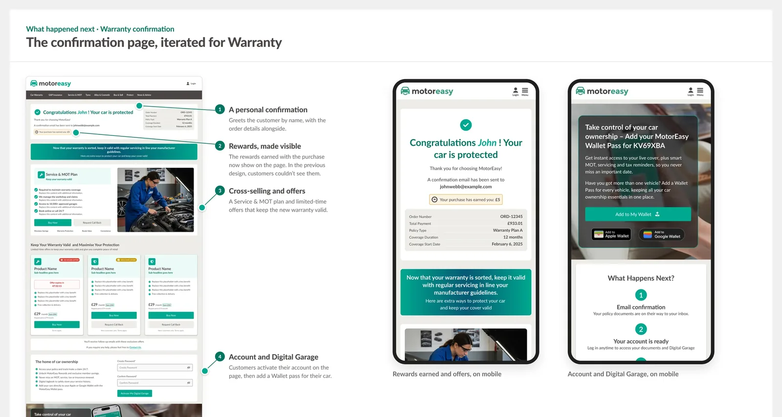
The confirmation page was a wall of text. Three headings competed at the top, and none confirmed what you'd bought or what would happen next. MotorEasy's confirmation email already answered both, so I repurposed the page around the email's structure: one confirmation, then what was bought, then clear next steps. The new structure also gave the marketing team a dedicated space for account benefits, the Digital Garage and relevant offers.
Where we landed and whyThe options we weighed
What I chose, and why: I repurposed the page around the email's own structure to show what was bought, then what to do next. It now shows one confirmation statement with a small moment of motion, then what was bought (policy details and payment summary), then clear next steps. I worked with the marketing team on what this page could do for them. The new structure gave them a dedicated space to build brand awareness and show the benefits of being with MotorEasy: account benefits, the Digital Garage and relevant offers. It was the one place in the journey where commercial content and what the customer needed pointed the same way.
Parallel Track · Design System
Bringing an in-house UI system to its first client
We had no design files. Until then, an external supplier had delivered designs as images, and developers worked out the specs from best guesses and legacy code. That was one of the biggest causes of the inconsistency and poor responsiveness we found in the audit. The timeline and budget were also tight, and the client wanted to review visuals, not wireframes, so we needed a working library from the first sprint. I had already built an in-house UI system for Netro42's design department, so designers could stop rebuilding libraries for every project and spend more time on UX. I proposed MotorEasy as the first client to adopt it. It works as a one-way fork: the master library is duplicated and rebranded with the client's colours and fonts, and from then on it's the client's own kit. New components live there and don't flow back to the master.
- 4 hours from the master library to a branded, client-ready MotorEasy UI kit.
- 1 sprint (a week) for the UI audit and the first design concepts, presented together.
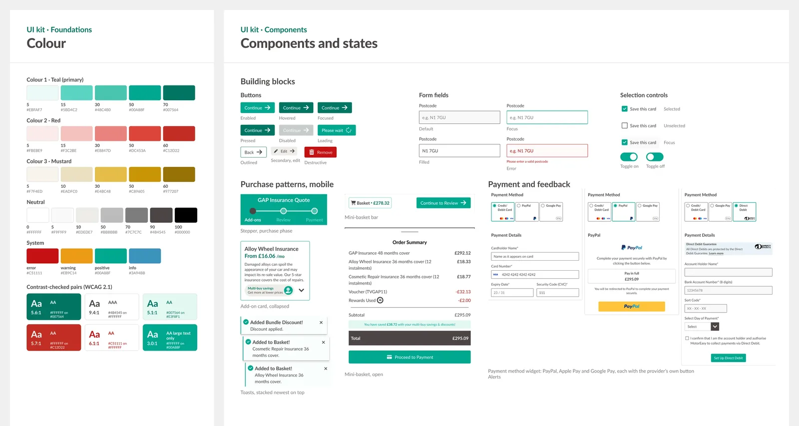
In the kit, I built the components the purchase steps needed (stepper, payment methods, mini-basket, pricing cards and order summary), and both designers worked from it from the first sprint.
From design to implementationWhere the UI system went
Where it went: The development department decided to implement it. In July 2025, I presented the system and this first adoption to the development team in Poland (Netro42's second office). The 30-minute session opened with a poll asking how many hours they lose rebuilding on each project (an estimate) and how confident they felt about consistency across projects. They decided it was worth trying, with Sebastian leading. He researched Storybook, Code Connect, and the Tokens Studio plugin, and built a pipeline that pulls tokens from Figma into the codebase, with Figma as the design source of truth.
In his words:
"It all dropped into a legacy codebase with far less friction than I expected."
Outcome
What changed
The six steps stayed, and the interface around them did the work. The header split the journey into getting a quote and buying; each step prioritises relevancy and accessible contrast. GAP went live in July 2025.
What happened next
The next journey, Warranty, built on GAP
The client commissioned the next quote journey, Warranty, in January 2026. That more complex product tested how much of the GAP work would hold up. The patterns became the defaults, the declined recommendation came back, and the confirmation page was iterated. We use the post-checkout page for cross-selling and promotions, and we added a section for account login and Digital Garage. For the first time, the marketing team had a consistent place to reinforce its messaging across the site and the quote journey.
In their words
I had the pleasure of working alongside Rocio during her time at Netro42, where she was a Senior UX/UI Designer who made the workflow between design and development genuinely easier. One of our more exciting projects together was rebuilding a client's multi-step purchase flows using a design system. I was the software engineer responsible for the Storybook research and the full implementation. Rocio brought in a UI system she had built and led it in Figma. It was well-structured and reusable, with states and edge cases covered, and accessibility handled properly. It all dropped into a legacy codebase with far less friction than I expected. That was as much down to how she works as to what she produced. Right at the start of the project, she walked me through design tokens in Figma, which I wasn't familiar with at the time, explaining how they work and how they keep components consistent and reusable. That conversation led us to automate exporting the tokens into the codebase. It also showed me that her designs aren't made for a single use. She builds them with future updates and changes in mind. She brought the same care to the details. When implementing the responsive design for the payment flow, including a mobile view of the persistent mini-basket, she documented the flow and walked me through the prototype. It cleared the ambiguity before I wrote any code. The flows shipped, and the system carried into a second journey redesign. Any team would be lucky to have her.
Reflection
What this project taught me
- Build the case, follow your gut. My instinct on the add-ons step was right; it just lacked evidence. GAP turned it down, and Warranty adopted it, like a seed that took a year to grow. But it needed a more complex product to make the problem visible, because I'd argued it once, verbally, with nothing to show. Next time I'd bring an artefact supported by an impact estimate and benchmarking.
- Document the system for whoever builds from it. The kit had no naming conventions or token documentation. The master library hadn't needed them, because only designers used it, but a developer building from a client kit needs both. I added documentation to the design file and to some components. It worked, but having documentation in two places could confuse whoever picks it up next. Before the next fork, I'd agree on token naming up front and keep the component documentation in one place.
- Being clear about what I don't know. I had no post-launch data, so here's what I'd measure next: completion by step, especially drop-off at Add-ons, on mobile and desktop; Online purchase completion for GAP, before and after launch; Whether customers understand the two-phase stepper, through usability testing with real customers.
Case studies