Redesigning a corporate booking experience, touchpoint by touchpoint
Leading product design for a corporate accommodation programme provider, from research to a live booking platform and a multi-brand design system.
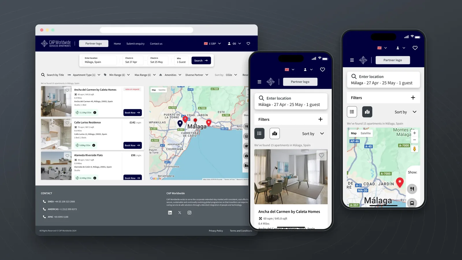
CAP Worldwide asked for a brand refresh; my research showed that the bigger problem was the product. I led its design as one evolving product: a shared design system, a redesigned enquiry form, a master microsite for every brand partner, and CAPStore, a self-service booking platform that went live in February 2026.
At a glance
The Problem
CAP asked for a brand refresh. The product was the real problem.
CAP Worldwide runs corporate accommodation programmes for multinational companies, with offices in London, Chicago, and Singapore, and access to over a million apartments worldwide. I had designed their marketing website as a junior designer in 2019. In 2023, they came back with a brief for a brand refresh to support their scale-up business phase.
The business had grown, but its digital touchpoints had been built one at a time:
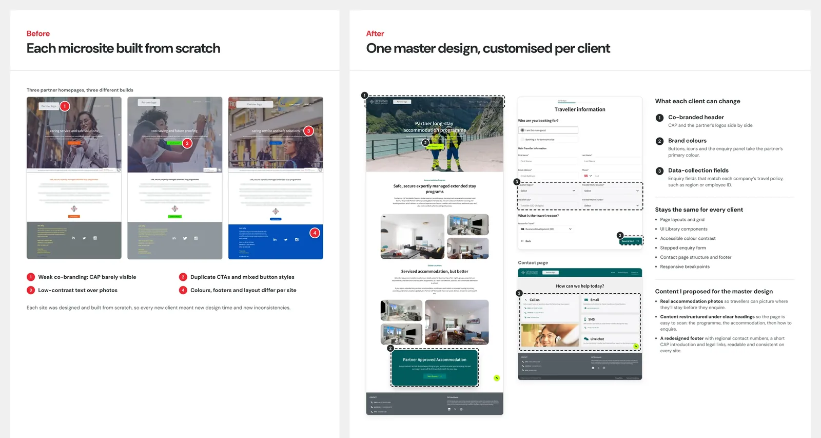
- Each corporate client's microsite started from scratch.
- Enquiry forms were long, static, and hard to use on mobile.
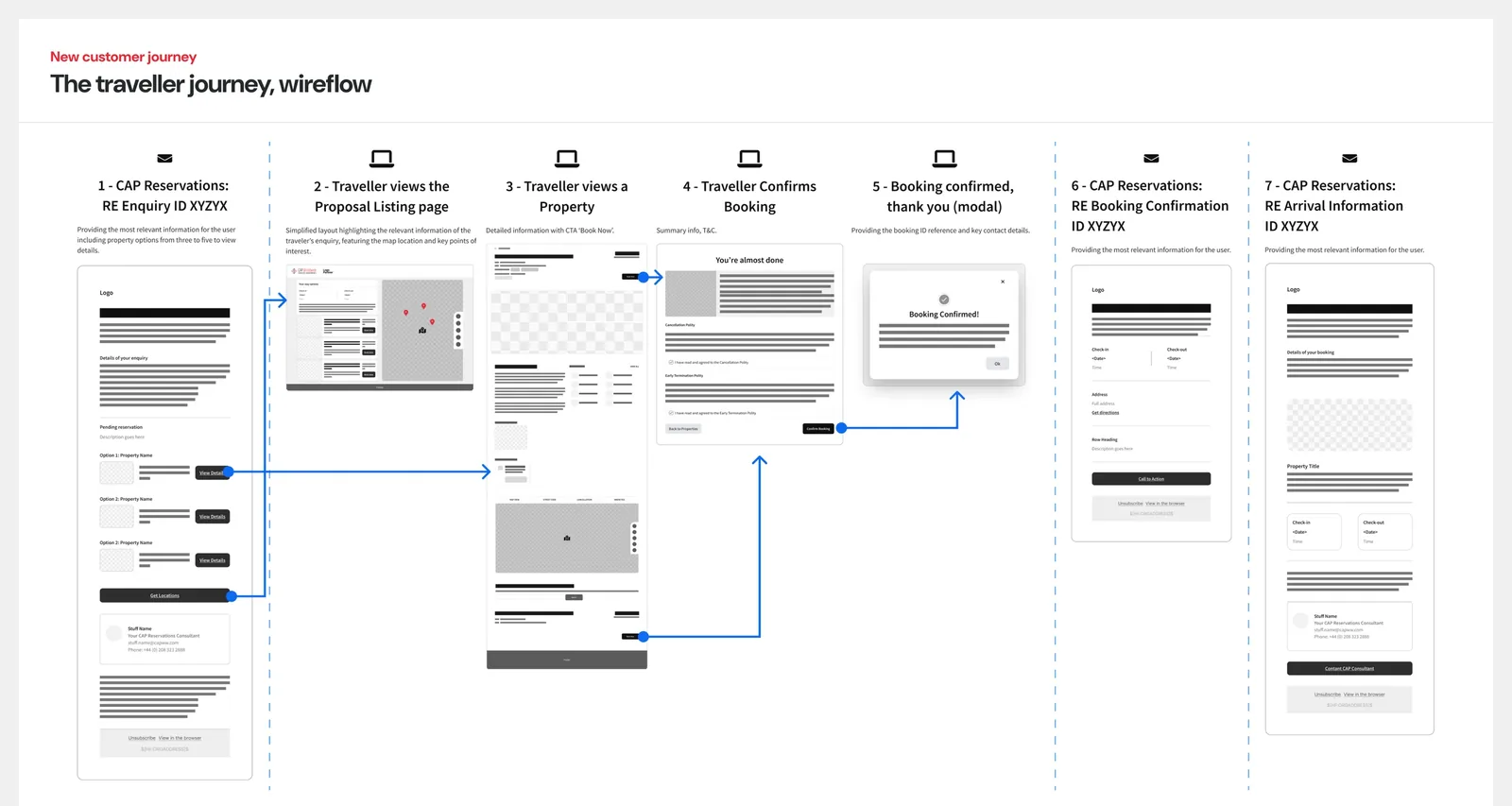
- The journey from enquiry to arrival had unstructured flow and unbranded messages.
Audience segmentsWho it's for
Corporate travellers: employees of CAP's clients, searching for and requesting accommodation for work.
Travel managers: people at client companies who oversee bookings, roles and travel policy.
Accommodation partners: providers who respond to availability requests and confirm bookings.
CAP's reservations team: internal staff who handle the programmes.
My role and the team
A small team with full ownership
How we worked together: Design and build ran in parallel, with regular internal reviews and tests to keep stakeholder requirements and the process aligned. In Tony's absence, I was the client's direct contact and kept the project moving smoothly. Regarding user and QA testing, the client ran testing with its own experts, and I iterated on the feedback they shared.
Sole designer and led design across the whole programme: research, strategy, the UI Library, and every iteration that followed.
Full product implementation, API integration and bridge to the client's third-party CRM development team.
Owned the client relationship, scope and budget, and was the first point of contact whenever the client's priorities changed.
Research
Ten findings that changed the brief
The research was commissioned to inform a rebrand. I led it as a desktop study across every place a customer meets the brand. I mapped touchpoints and brand assets, conducted a heuristic evaluation, and reviewed four corporate-accommodation providers, comparing first impressions, content, features, and competitor review of four corporate-accommodation providers, comparing first impressions, content, features and consistency.
I grouped ten observations into three emerging themes: brand recognition, content and storytelling, and continuity and efficiency. The ones that stood out most:
- The same brand looked different everywhere. Headers, footers, buttons and menus differed between partner microsites.
- Key content was hard to read. Text over busy hero images lacked contrast, and the partner portal login had unreadable text.
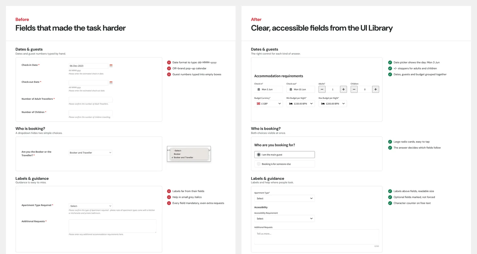
- Forms weren't accessible. They weren't built for mobile, inputs didn't match the data they asked for, and guidance was missing.
I presented the findings to CAP's stakeholders, with eight opportunities ranked as quick wins, major gains, foundational or strategic. After reviewing the report, they decided to fix the product experience first and park the logo and rebrand. Three design decisions came out of it.
Three decisions across all touchpoints
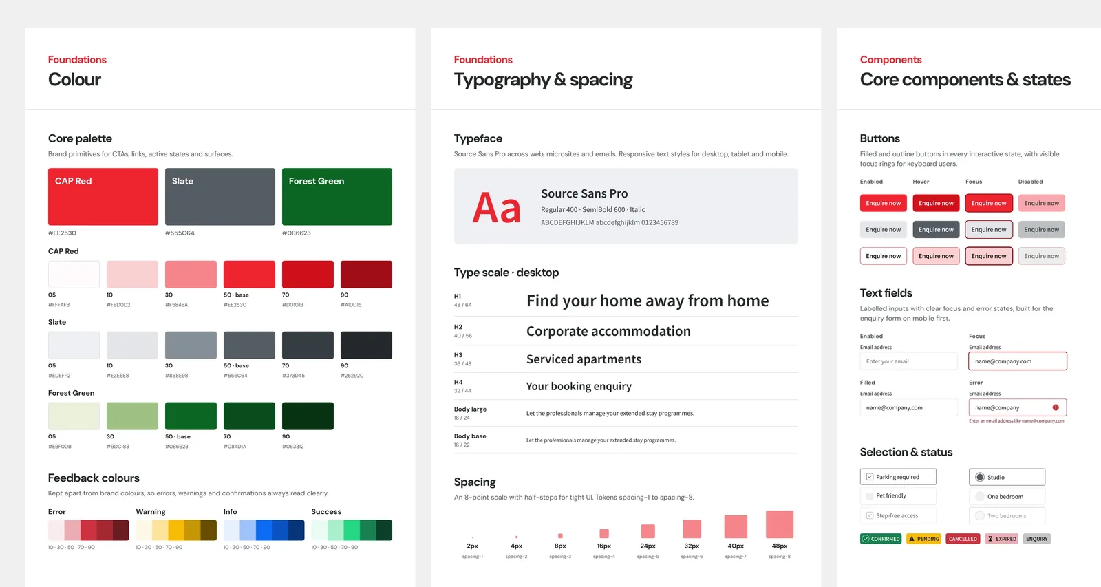
1. A single source of truth: the CAP UI Library
Every touchpoint had been designed in isolation, so the same brand looked different everywhere. I recommended building a design system before designing any more screens, and the client backed it. I built the library from the ground up in Figma, with WCAG AA accessibility as a baseline. Its first test was a proof of concept for CAP's pitch to a major corporate client, which later became the starting point for CAPStore.
2. Redesign the enquiry form, don't just reskin it
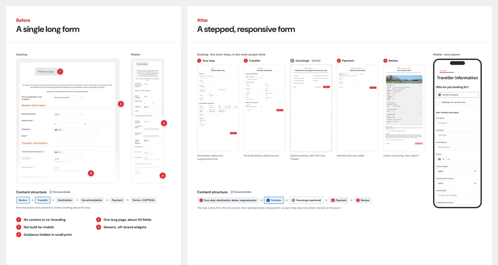
The scope was to restyle the existing form. My research had already shown its problems, so I proposed a full redesign: a stepped, fully responsive form with accessibility built in and clear field labels. I added CAPConcierge Services as an optional step with a clear "Skip", so it never blocks the enquiry. The form became a library pattern on every partner microsite, the customer journey and CAPStore.
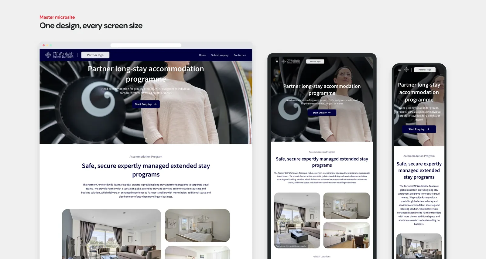
3. One master microsite, customised for six clients
Each client microsite had been built largely from scratch. I proposed a master design built entirely on the UI Library and used as the template for every client. Six corporate clients across aerospace, energy, health care and pharmaceuticals got their own microsite over 18 months, each with a co-branded header, brand colours and its own data-collection fields. Based on my Jira hours, the fourth took about half the design time of the first.
New Customer Journey
Streamlined booking and an enhanced email experience
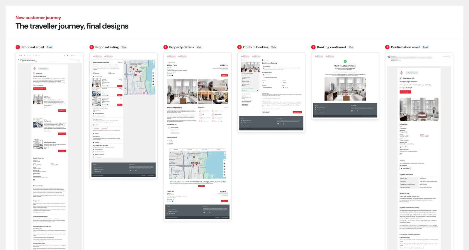
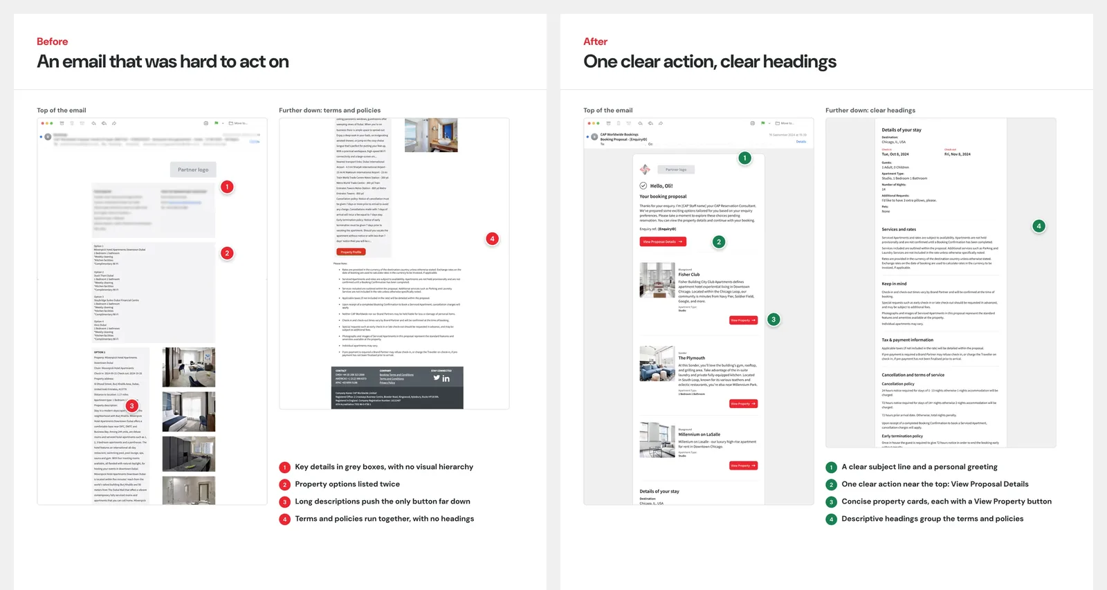
Our client's booking journey already existed as a process run by its reservations team. I worked closely with the client to turn it into pages, modals, and emails that travellers and partners could understand at a glance, and built it all into the UI Library: five traveller flows, a seven-stage status system, nine redesigned partner emails and 16 email templates exported as production-ready HTML. The client tested the flow with its own experts, customers and partners, and I iterated on their feedback.
Structure, information architecture, writing and email communication.Where I focused
One structure for every modal, and accessible throughout. Every modal used the same parts in the same order: an icon for the message type, a descriptive title, a short explanation, and a clear next step optimised for desktop and mobile.
Nobody left stuck. Already booked, a proposal that is inactive or cancelled, dates no longer available, a change or cancellation request: every stage offers a way forward, whether that is an action, a way back, or the team's regional phone numbers when the system can't help.
One event, one voice. The same event reads the same across the experience.
Emails that are easy to act on. I audited CAP's existing emails first. The information was there but hard to find, so I grouped it under descriptive headings, put one clear action near the top, and made the tone warmer and clearer.
A new touchpoint · Where it all comes together
CAPStore: from a partner microsite to a self-service booking platform
Our client offers two tiers for corporate clients. A partner microsite is a co-branded site where employees send an enquiry, and CAP's reservations team finds the accommodation. CAPStore is the upgrade: a signed-in platform where employees search and request bookings for themselves, and travel managers get an overview.
Three new design calls:
- Search and map side by side. Prices weren't always available when searching, and distance was often the most useful way to compare properties. The side-by-side layout allows easy comparison; on mobile, it becomes tabs, and filters move to the left drawer navigation.
- "You're almost done", not "Booked". The system sent a booking request.
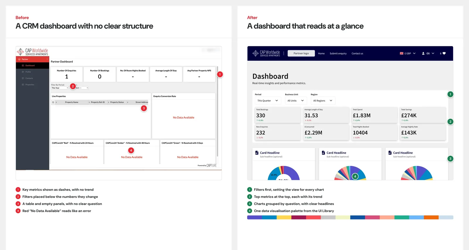
- A dashboard that reads at a glance. The client defined which metrics to show. I redesigned the dashboard, added structure with top metrics at the top, and I assigned it a data visualisation palette in the library.
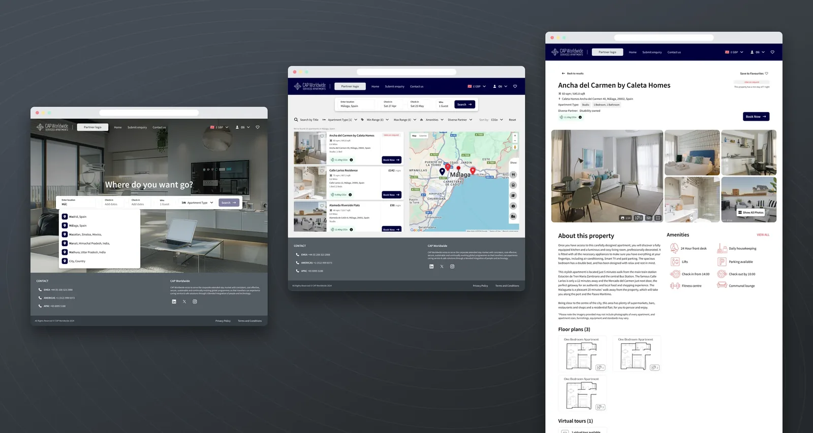
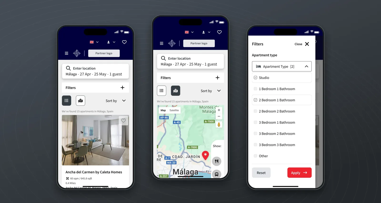
The first CAPStore went live in Feb 2026. After the launch, the client approved a second CAPStore for another client. The developer built it himself using the CAPStore master design and the established design language. This meant that almost no new design was required, and the developer reused components. CAP has since commissioned one more on the same basis.
What happened next
CAP UI Library v2.14.0: from one brand to brand modes
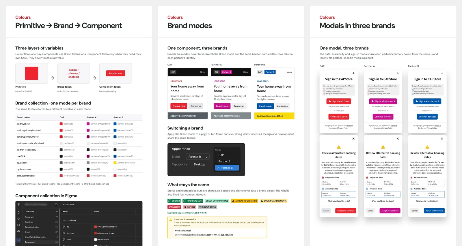
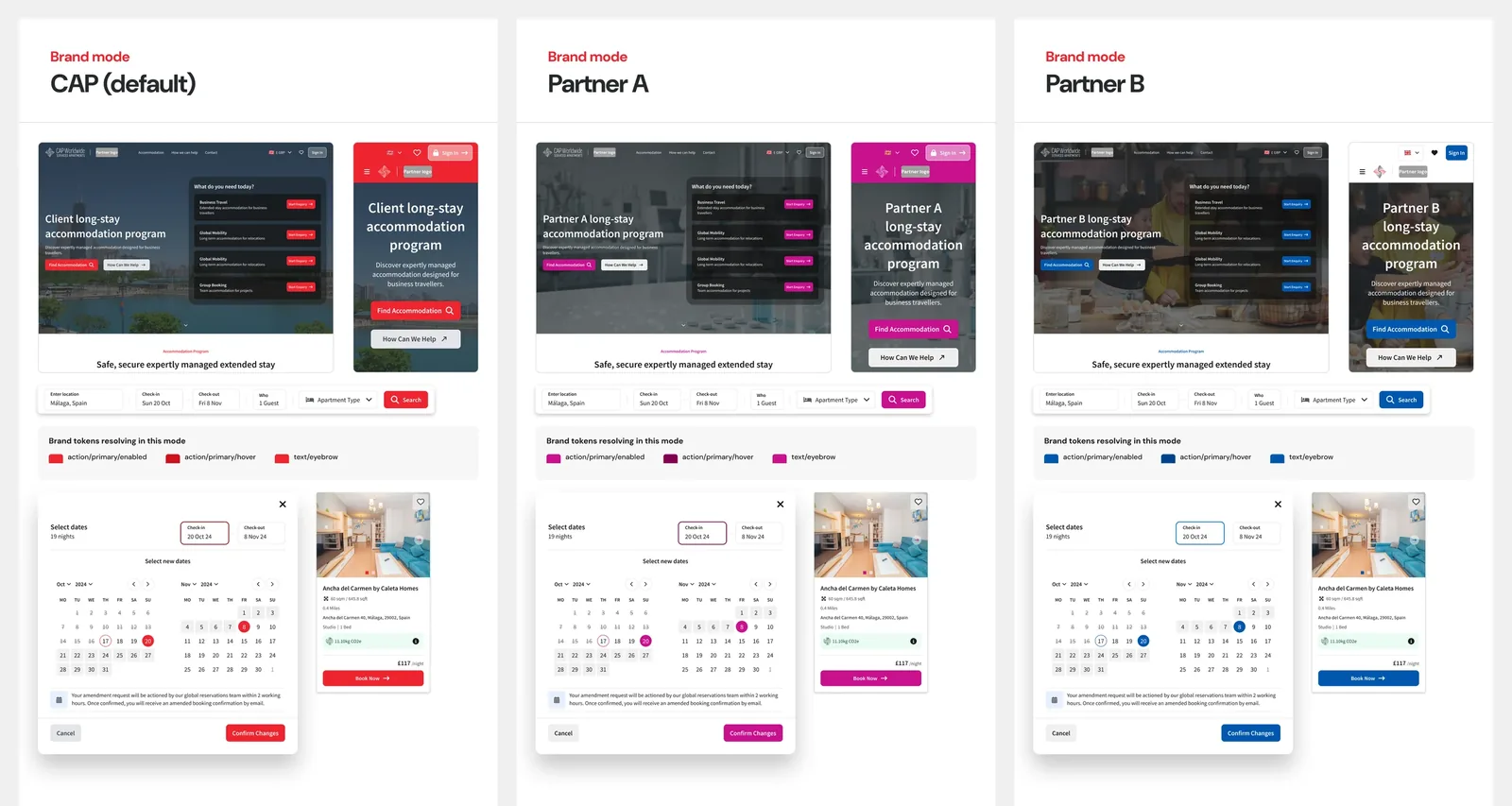
I started the library in April 2024, built it for one brand, and duplicated components for each partner. I rebuilt it so that a brand becomes a set of values in one Figma mode collection: 15 releases in six weeks, with four contrast defects in the live product fixed along the way.
Self-initiativeHow the rebuild worked
It was built for one brand, and duplicated components for each partner. I audited and rebuilt its structure so that a brand becomes a set of values in one Figma mode collection. I found that duplicating components worked once, but after that, I had to manually link each component to the new partner variant for each brand. For a team of one designer and one developer, that cost would have grown with every new implementation.
What it led to. 15 releases in six weeks:
Switching modes meant the same components took on a partner's identity and were re-linked to tokens accordingly. This meant that, on the front end, I could toggle brand mode, and everything changed to the brand partner.
I fixed four contrast defects in the live product, including an expired badge that went from 1.88:1 to 9.34:1.
I used AI for the volume work (30,526 colour bindings), recorded the changelog, checked every result, and made specific amends myself.
Metrics
Outcome
CAP Worldwide became a long-term retainer client, and work grew with them: from a shared design system to microsites, a booking enquiry journey and a self-service platform, each phase building on the last. The system also changed how the team worked. The developer could often find answers in the library and build new products with almost no new design. Marketing material, such as the presentation pitch template, was delivered in the same design language.
In their words
"She was incredibly passionate, dedicated and always brought real enthusiasm and creativity. She came up with great ideas and had a fantastic ability to put herself in our clients' shoes. Her commitment to both our clients and the wider team was awesome."
I had the pleasure of working with Rocio at Netro42 on an exciting project, supporting a client through the digital transformation of their business booking platform. From the very start, her creative thinking stood out, and her design work was clear and well thought out. She was also great to work with as a developer. Her designs were complete and easy to follow. Her Figma library and design system were so well built that I could often find answers on my own. On one occasion, I built a brand-new page using only her components. When something was hard to build, she listened, considered every perspective, and worked with me to find the right trade-offs. Together, we delivered a multi-brand booking platform for corporate accommodation over a phased project, building a strong relationship with the client along the way. We made a great team, and I learned a lot from her. Rocio is talented, reliable and kind. Any team would be lucky to have her, and I recommend her without any doubt.
Reflection
What this project taught me
- Treating many touchpoints as one product. Each piece of work built on the one before: the library, the form, the microsites, the booking enquiry journey and CAPStore. That systems thinking meant designing for what comes next, not only for the current brief.
- Foundations pay off, and then they have to grow. The library started with one brand and duplicated component variants for each partner. That stopped scaling as partners were added, so I rebuilt it around brand modes.
- Being clear about what I don’t know. I had no direct access to users or usage data, so I made my decisions traceable to what I could measure myself. Next, I’d track how people search (what they type and how often they get no results), enquiry completion on mobile, CAPConcierge take-up, where the reservations team still steps in by hand, and time to launch a new client. I’d pair these with regular usability testing.
Case studies